This eye-rolling and hilarious fact has been reported on by a number of outlets, but I think I first saw the number of confused searches in this tweet:
— Ashwinn (@Shwinnabego) November 17, 2022 I remember when Kias with the new logo started to appear, and I think the only positive thing I heard was that the new look reminded people of fond memories of Nine Inch Nails:
So, there’s that. But that doesn’t change the fact that Kia’s new logo absolutely reads like “K-backwards-N.” I mean, I get that it’s fun to eliminate the crossbar of the A so it looks like a lambda, but in the context of this design vocabulary it just doesn’t work. That’s not to say it’s not an improvement in some ways; the old Kia logo was, at best, boring. Here, let’s look at the history of Kia logos:
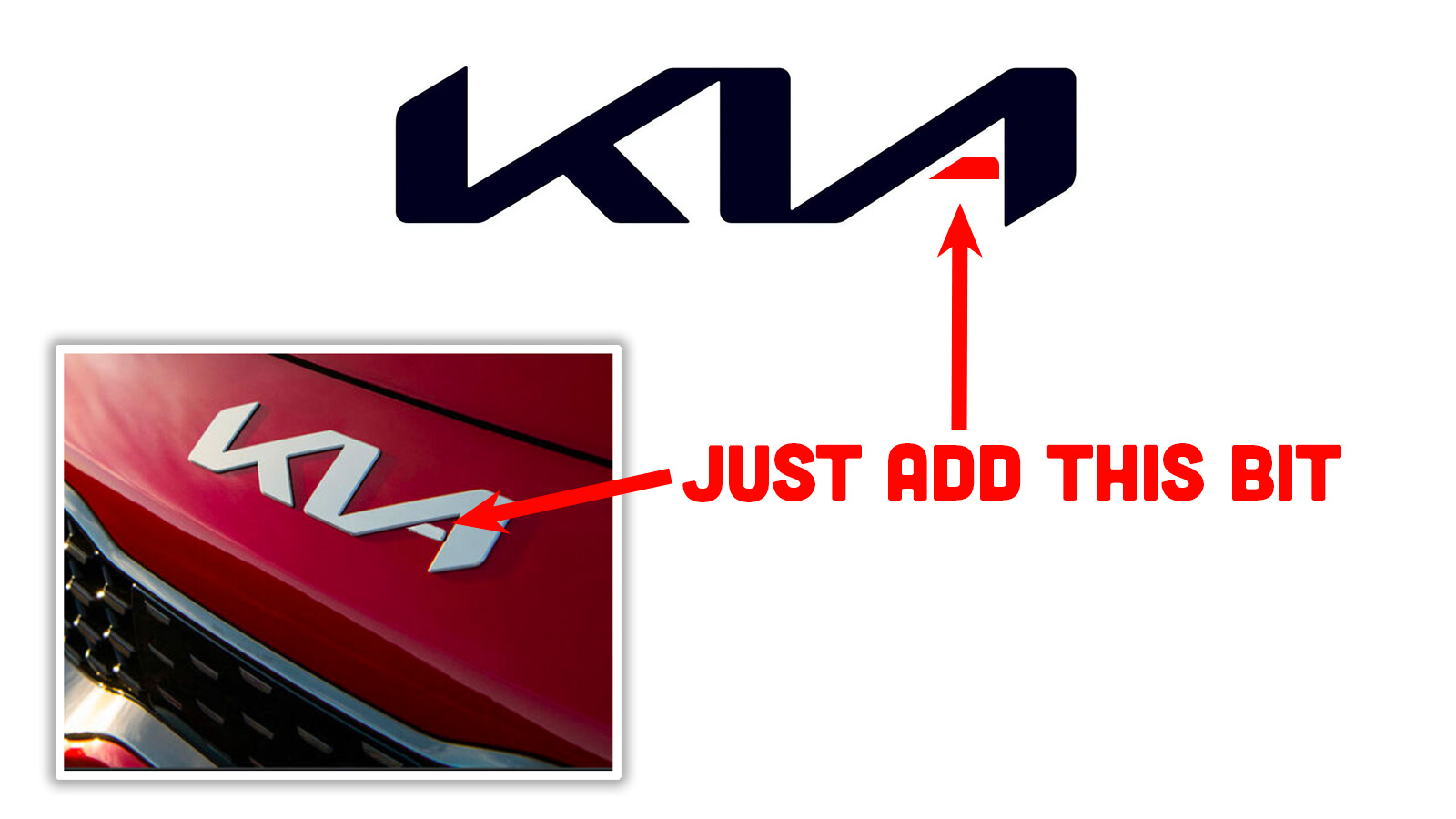
Man, what a journey! I kind of like the happy flag-waving of the 1986 logo, and that inverted-Q thing is pleasingly simple and cryptic. I think the real mystery here is why Kia didn’t just adopt the Korean “flying K” logo for global markets, since that is abstracted enough to not suffer from alphanumeric legibility problems. And it looks good, sort of evoking lightning strikes or knees bent mid-run or a pair of bird profiles in flight. It’s not bad! Of course, a logo does not need to spell out a carmaker’s name; plenty of logos don’t, but we equate them with the brand just fine. Think about Mercedes’ tri-point star or Subaru’s stylized Pleiades or Peugeot’s lion or Audi’s four rings of the old Auto Union or a leaping jaguar, and so on. But what makes those logos different is that they’re not actively confusing. This isn’t about a non-wordmark logo, it’s a problem of a logo made of letters looking like the wrong fucking letters. If the Mercedes-Benz star looked like a P or something, it’d be weird, for example. But, no, that’s not the path Kia chose. Instead it went with the confusing not-KN logo, and here we are. But you know me, I’m the kind of guy who’s going to change the 1157s in your taillight rather than curse your darkness. So, with that in mind, I think I have an easy solution to Kia’s logo problem. Just this minor tweak:
See? Easy! Now it reads like KIA again! And you don’t lose the stylized look or anything, it just breaks up the ᴎ-shape in the logo so it can read like two separate, recognizable glyphs. Even better, this change was specifically designed to be able to be retrofitted to all affected Kias on the road! In fact, our very own crazy designer of things, The Bishop, spent some crucial procrastinating time mocking up the packaging for this service part and the required technical service bulletin and inevitable recall notice:
Look at that, Kia! We got your back! Now go call your supplier of adhesive-backed-chrome-look things and tell them you need a little hyphen-shaped deal and get the ball rolling. Type KIA into Google translate to get the Korean. At the bottom of the translated box, you will see the Google transliteration of the Korean as ‘gia.’ You can also listen and hear the subtle mixture of K and G. As far as I recall, there isn’t a hard rule for official transliteration. For this reason, I worked in either Kyeonggi-do or Gyeonggi-do. Google maps prefers the latter. I lived in Bundang-shi, but it could have easily been Pundang-shi. However, I did not often see that version, since someone may have recognized that it might be confused with poontang. 😉 https://ibb.co/NKC3MP1 (source: I’ve been living in South Korea since 2004).


